Beseye App

Security Camera System

Overview

Beseye is a startup that provides artificial intelligence image analysis services for security cameras. Company provide security camera, App and Web in Business-to-Customer marketing. After user pairs the app with the camera, they can view camera real-time video, past event recordings, captured images, two-way voice communication and other functions through App.

My Role

UI/UIX Design, Product strategy, User research, Wireframe

Timeline

2018-2019

Problems

problem_graphic_01

The way of UI layout development in the past leads to bad user experience in large screen size.

Since the App development time across about six years, the ui layout design is scale up from small screen size. It adopt compatibility in development process. As a result, when the large screen size mobile becomes the current trend, the UI Layout is misplace to bring about bad user experience.

Redesign the main ui flow and existing issues

View the main features of the App: Watch live video (Live View page) and find the past events at the moment which user cares (Event List page), and watch the event video (Event View page). The UI has many buttons on there, but there are not necessary for user. The UI flow also interrupting the users workflow.

problem_graphic_02
problem_graphic_01

UI design Inconsistencies

The product has been designed by many generations of designers, and the previous UI design is also a graphic designer. As a result, the design file is not integrated, and the color, text and various UI components are not consistent.

Why do qualitative user research?

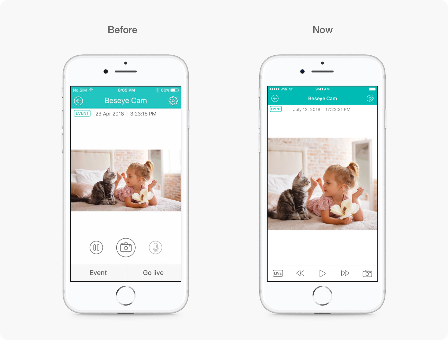
Build better user experience by gaining insight into users

There were never conducted any research to understand user behavior since company was found. I received feedback from users through customer service, feedback on marketing opportunities, and online platform comments. But, It's difficult for me to directly realized how the user interact with our products and how the user feel.

we can not understand motivation behind the behaviors of user by getting quantitative data

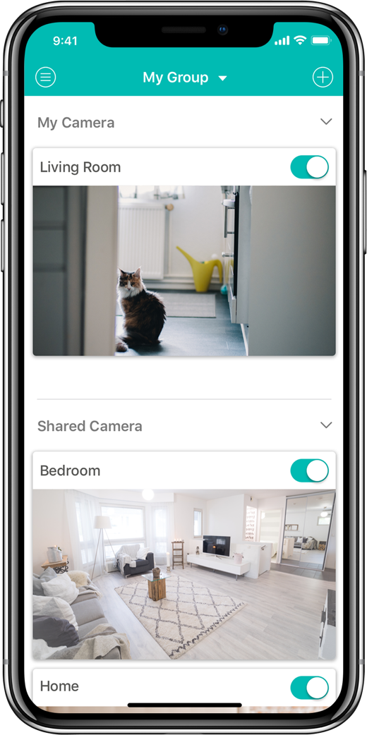
We use the tools of UX analytics data, which is mainly used to collect macro data and understand the overall user data. However, the indicators that have been embedded in the past cannot fully obtain the required information.

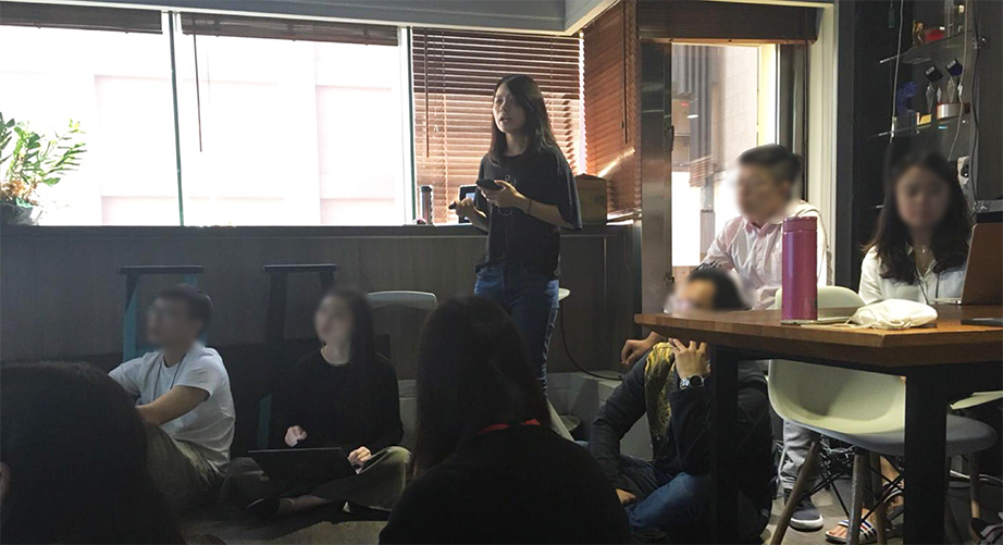
increase the awareness of UX

I want to promote the atmosphere of UX into the company. We could be more deeply considered user experience in the process of product planning and design, improve the quality of product service, and even bring more benefits.

Interviewee

Conclude the Feedback

we discussed the feedback according to user journey, written down each feedback and started to talk their thoughts in turn, understanded the user scenario and motivation.

Because it is the first time to conduct user research in the company.

We discussed the problems encountered by users. According to the three indicators were respectively functional importance, frequency of encounter and feeling of depression and to sorted in high, medium and low. Finally, it is arrange to the schedule to be improved.

Notable Findings

- The connection between the product and user. User would like to interact with product.
- We can think about why our product appeal to iOS user. Is it our product positioning
- The user's interpretation of the AI function is different from team's expectations.

Results

- Most users are confused and helpless about the use of process interruptions.
- In the way that not over-modify and reduce development costs and to add some functions to solve the problems encountered by users.

Design Solution

A. Improve the UI Flow of main function

UI Flow : Before v.s. Now

UI flow effects the fluency of use and even interrupts user workflow. These problems result in bad user experience.

improve the UI flow and record the moment that user last stop to avoid finding the moment repeatedly from scratch. To meet the user scenarios and needs.

B. Redesign uiux and function

a. Live View

1. According to Miller's Rule of Seven, people can't remember more than seven items in a short memory, so we confirm the need for each function on the UI and leave important features on the screen.
2.In the Live view, user just wants to view is present. There are not necessary to put "pause" function. Further, we check the quantitative data to learn the "pause" only account for 0.1 percentage in the screen. It almost never used.
3. The Go Live Button status is disable, but still placed on the screen and distract the user's attention.

Solution

When we interview with user, we found that they were focus on the video, It should not have excessive buttons and icons to interfere them. As a result, we only leave the "event list", "screenshot" and "two-way talk" icon.
These icon are positioned based on Fitts’ Law. With the options to use near the thumb. 。

b. Event List

The "go live" button on the beginning of the page, but It's overlaid when the screens scroll down. And, we could go back by the "close" icon on navigation bar. The button is unnecessary.
User often scrolled down continuously to find previous moment, but they didn't notice the button on the lower left corner to reach the specific time fastly.

Solution

Put the calendar function on the Navigation bar. It is a familiar place and user didn't need to learn it.
Remove the go live button to make the content more focus on the thumbnail of each event.

c. Event View - From event list

As live view, there are disable button on the screen and distract user attention.

Solution

We remove the unnecessary functions and make it focus on the event video.
From the user feedback, We add the "fast forward" and "rewind" function to make user find the specific moment.

C. Define Design Specifications

The Beseye product is a tool-based software that provides users with the expectation that they should be used as soon as they are opened. Therefore, the App design follows the system specification and uses native component to develop, which not only reduces development costs, but also makes the user easy get started.

The product has been designed by many generations of designers, and the previous UI design is also a graphic designer. As a result, the design file is not integrated, and the color, text and various UI components are not consistent.Therefore, I define the components and colors that will be used:

a. Typography: Text size and color, applied to different UI pages.
b. Colors: define the color to solve the same color has different color code.
c. Icons: Redesign the icon in the same size and line thickness.
d. Component: Define UI components and uniform styles, and build them into the Sketch Library for sharing by different designers.

Build consistency icon design

By the function of Sketch Library, it is possible to reduce the occurrence of multiple files in one app, provide more than two designers with common specifications and make product design has consistent design.

​After the optimized version is online for three months

Before optimizing the function, we set the expected increase number in usage. In addition to proving the changes by data, we also want to build the intuition of how much resources will bring how much benefit.

​What I learn from this project?

Rethinking the value and meaning of user research for startups

After conducting the research and returning to the daily operation of the company, I began to think about paying attention to the UX, it would not bring benefits to the company immediately. At the same time, such a startup company which is striving for more venture capital on a regular basis, grab any chances to exposure and proactively takes business cooperation. Does it really make sense to do these things?
After that, I realized that UX is not independent. UX is a combination of user experience design and business strategy. To reach balances between user experience and business goals, and tries to put business benefit evaluation into the project. That is the value UX brings.

Talk out the idea and try to prove it

Before speaking the idea that we want to do a user research, there are still many projects should be developed in company. Everyone has their own important things at hand. we didn't have any experience on it. Besides, we are very clear about optimizing the user experience and conducting user research, there is no immediate benefit for a startup. However, after gaining support through communication with the superiors, we conducted this user research to optimize the user experience and try to bring the UX into the corporate culture.

Learning journey from the user research

a. how to plan and conduct research
b. interview skills and details that should be noted
c. teamwork to discuss the feedback and results

Improve cooperation between teams

Let everyone on the team see the feedback from the users real reaction, which can promote everyone to make an all-out effort to development and improvement product.

Thanks for your watching.

Back to top